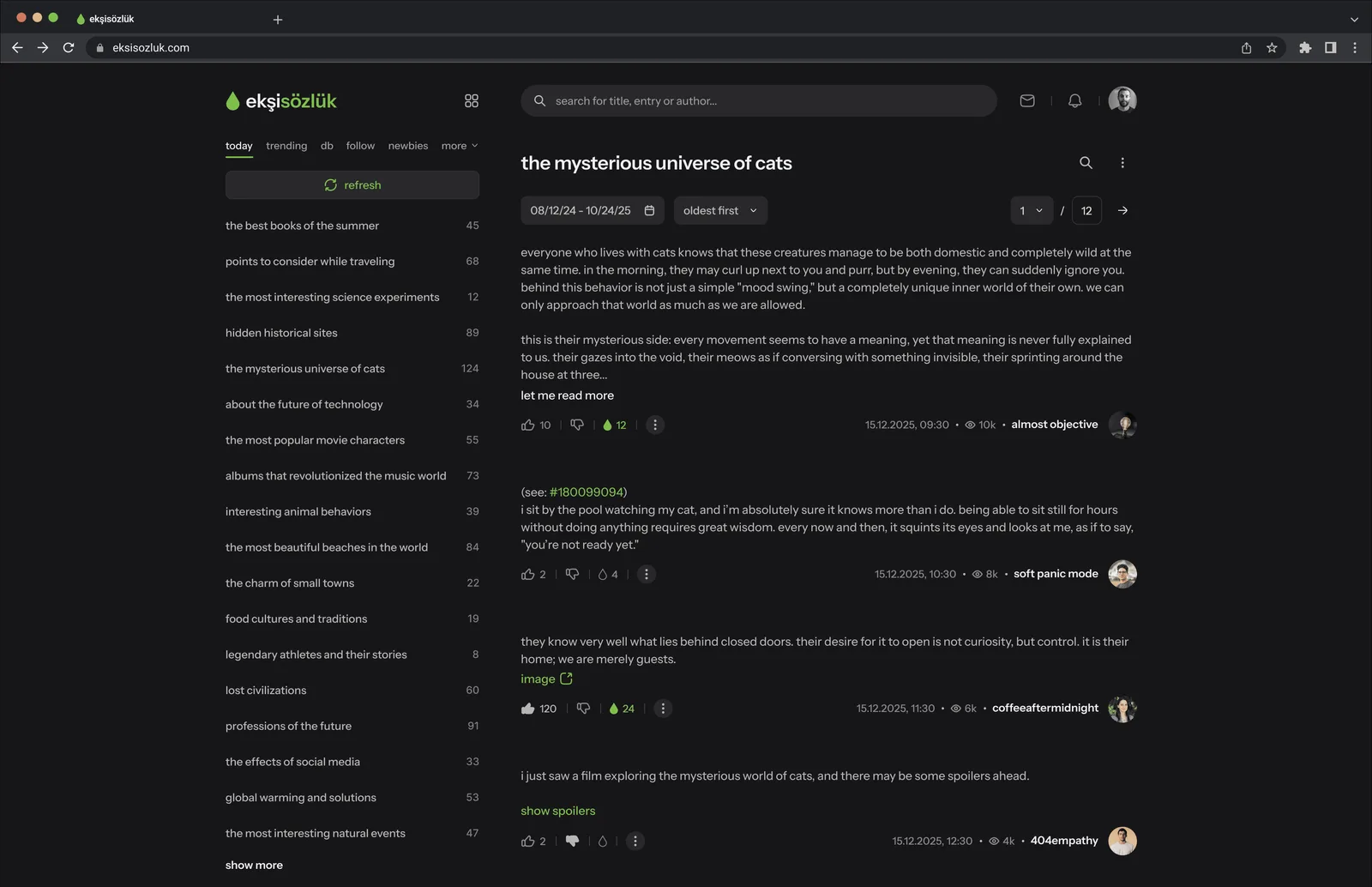
Overview
This is a personal, non-commercial UX concept, not affiliated with or endorsed by ekşisözlük or its owners. The question was narrow: how do you modernize a 25-year-old platform that millions still love for its minimalist, anonymous, reading-first character?
ekşisözlük is Türkiye's largest digital community and archive, not just a website. I approached it as a long-time reader doing an interface audit: map recurring friction, then propose fixes that make the same product more efficient without turning it into something else. Thesis: refinement over reinvention.
Challenge
The interface has changed little in two decades. That consistency built trust, but it also left real friction. The platform can feel outdated and slow when someone is trying to find a specific day in a topic, catch up on activity, or stay inside an entry while looking at media.
I prioritized three problem areas. Highest: date discovery in long topics is still pagination and guesswork. Next: notifications are fragmented, so catching up means hunting across surfaces. Then: images break reading by opening in new tabs. Messaging hierarchy and spoiler safety showed up as smaller, high-trust fixes once those foundations were clear.
Solution
Five targeted improvements, ordered by how much they unlock everyday reading. None of them redesign ekşisözlük from scratch.
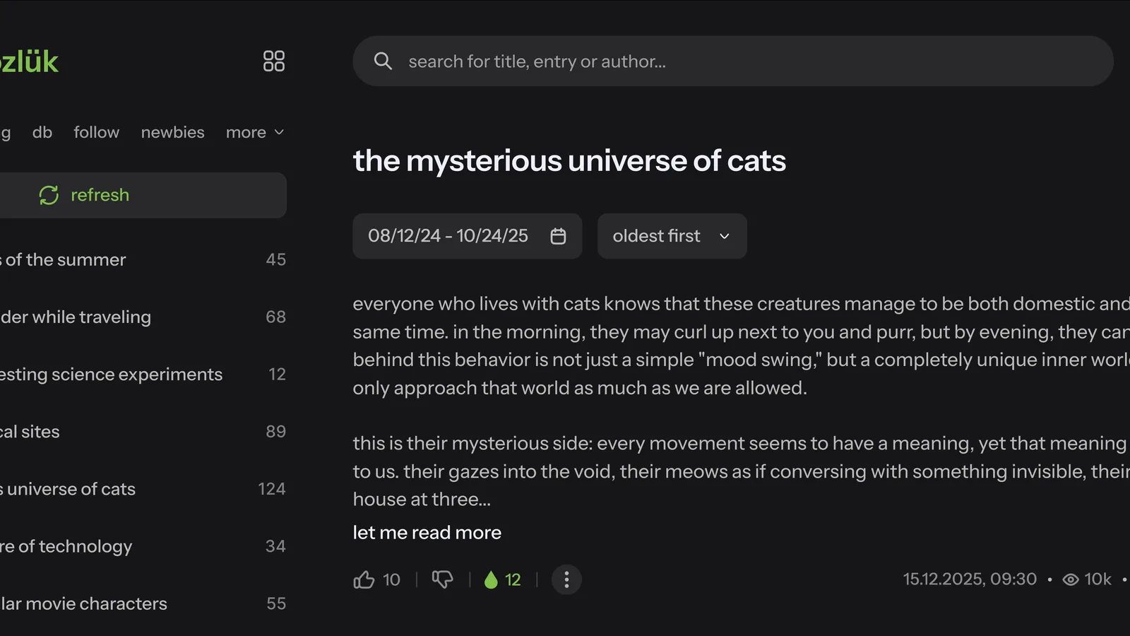
Date-based navigation
Topics have no way to filter by date today, so finding a specific day means clicking through pagination and guessing. For an archive this size, that is the core discovery failure. I added a calendar date picker so users can jump to a day or range directly: less hunting, more reading.
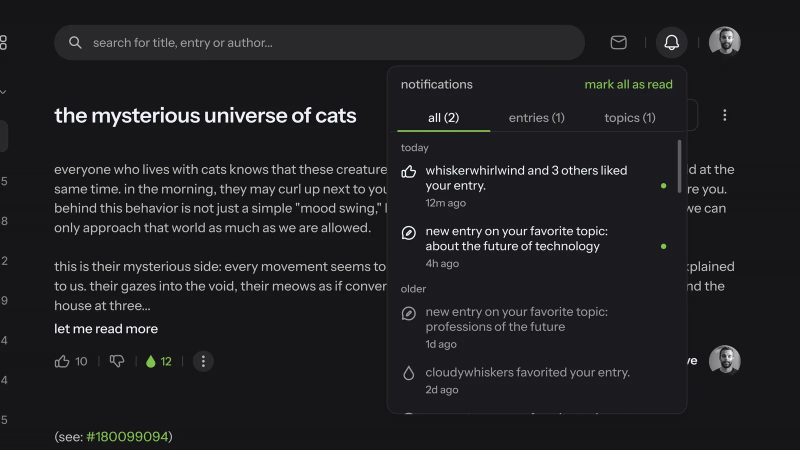
Unified notification hub
The legacy notification view is a wall of followed topics, while messages, likes, and favorites live elsewhere. I consolidated everything into one scannable dropdown, grouped by type, so catching up is a single pass instead of a scavenger hunt.
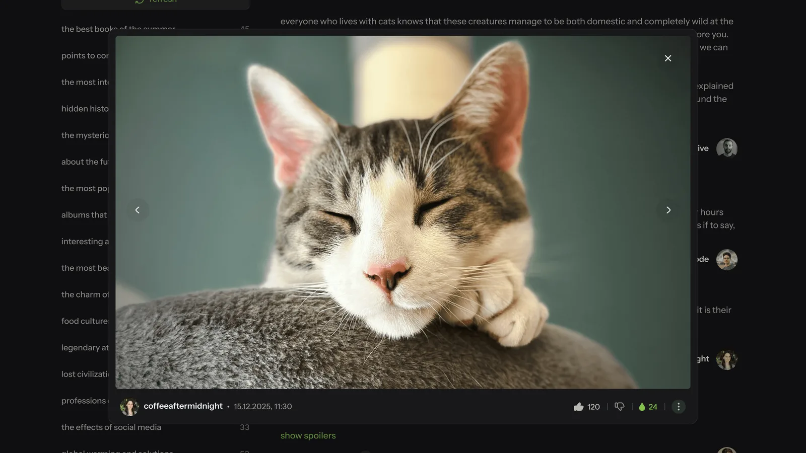
Integrated photo gallery
Clicking an image today opens a new tab. The visual leaves the entry, and context disappears. An in-page lightbox keeps users inside the thread while preserving entry metadata around the image.
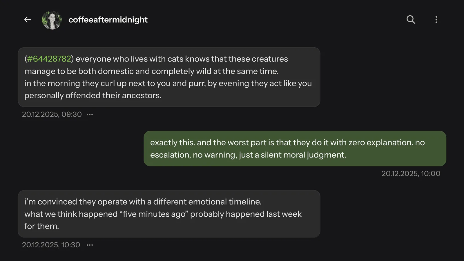
Messaging for anonymity
Messages needed clearer hierarchy between sender and receiver. I deliberately avoided real-time cues like typing indicators or read receipts. In an anonymous community, those features create social pressure. The redesign stays asynchronous and text-heavy: more usable, same quiet contract.
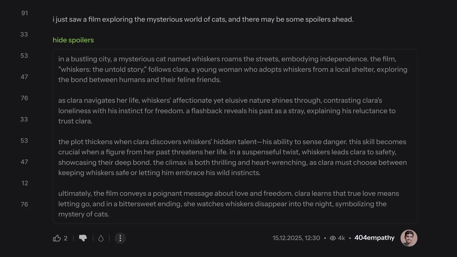
Intentional spoiler disclosure
Spoilers are visible by default. One accidental glance ruins a thread. I hid spoiler content behind a deliberate tap-to-reveal layer so users can browse risky topics with confidence. Small interaction, high trust payoff.
Principles
Before designing screens, I locked three rules: reading stays primary (every feature must support it, never compete with it); fix what is broken without reinventing what already works; and reduce the steps needed to find information.
That meant leaving the cultural core alone: anonymous identity, the dry reading voice, and the overall visual language people already trust. The work is evolutionary on purpose. On a product like this, restraint is the design decision.
Outcome
This is a concept, not a shipped redesign. If these changes landed, a daily reader could jump to a date inside a long topic instead of paging, catch up on likes, messages, and followed topics in one hub, and stay inside an entry while viewing media. Spoilers would stay hidden until chosen, and messaging would stay readable without live-presence pressure.
Before proposing anything to a real team, I would validate the date picker and notification hub with regular readers first. Those two carry the most of the experience; the rest should follow only if they still feel inevitable in use.