Overview
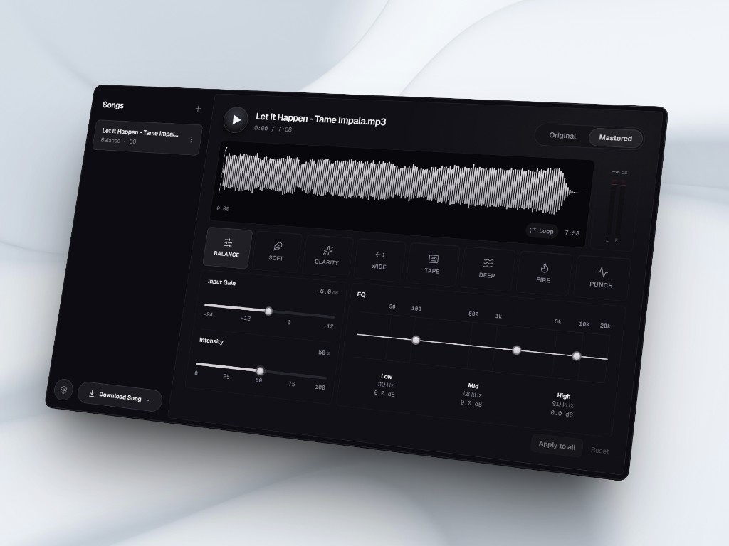
Mastr is a browser mastering desk I designed and shipped for independent musicians who want a final polish before release, without a studio or a DAW session. The job is simple: import a track, hear a clear Original vs Mastered comparison, pick a direction, and export.
Constraints shaped every layout choice: real audio in the browser, dense controls on one desktop screen, and no install step. The product thesis stayed fixed: a listening desk, not a settings app.
Challenge
Hiring a mastering engineer is expensive. DAWs are heavy for a last pass. One-click “AI masters” often skip a trustworthy before/after, so people cannot tell what changed. Early concepts for Mastr also failed for a familiar reason: they looked like control panels. People needed to listen first and decide second.
Three tensions defined the problem. Waveform and meters had to lead while chrome stopped stealing attention. Song, preset, and A/B states needed calm orientation, not loud strokes. And in Original mode, mastering controls had to clearly turn off; otherwise the comparison lies.
Design
One desktop desk, grouped around import → hear → compare → decide → export. File management and deep shaping stay secondary. I designed in hi-fi from the start: iteration happened in hierarchy and honest A/B inside the shipped UI, not in a separate wireframe phase.
Key decisions
Two choices carry most of the product: how Original vs Mastered earns trust, and how much control appears before someone has a direction.
Believable A/B
Keeping mastering controls visible in Original would preserve visual continuity, but it makes the comparison feel rigged. I considered matching chrome in both modes (faster to scan, weaker trust), then chose to dim and disable mastering UI in Original and restore it in Mastered. Users have to believe they are hearing the source, not a dressed-up version.
Depth on demand
Mastering UIs often dump EQ and gain upfront. Most sessions need direction first, trim second. A full plugin-style stack on the main desk was an option; I chose eight presets plus intensity as the primary move, with EQ grouped below. Presets answer “what vibe?”; sliders answer “how much?”; EQ is for the ear that wants more.
Outcome
Mastr is live at mastrmusic.vercel.app. The thesis is in the product: Original honestly disables mastering UI, presets lead before deep EQ, and the desk stays organized around listening rather than a wall of controls.
I have not run formal usability studies yet. The first metric I would instrument is time to a useful Original / Mastered comparison after import. If that path is fast, the desk is working. If people reach for presets before A/B, hierarchy still needs work.